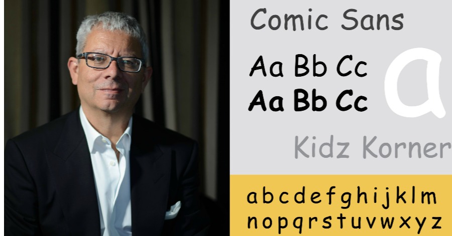
Since childhood, we have been familiar with various types of fonts ranging from Times New Roman, Arial, Helvetica, Calibri to Comic Sans. However, of all the above fonts, only Comic Sans is the most hated until there is a campaign called ‘Ban Comic Sans’.
Called the most annoying font especially those involved in the field of graphics, this is the story of how the Comic Sans font was created and then hated by a lot people.
Inspired by comic writing

Comic Sans was created by Vincent Connare, a Microsoft designer to ‘counter’ the Times New Roman font which is considered too formal. Comic Sans is inspired by comic writings like Batman: The Dark Night Returns.
That type of font emphasizes on writing style, looks playful and casual for a Microsoft children’s video game, Bob.
Initially, Comic Sans was only used for children’s learning applications and programs.
However, it is not certain how Comic Sans later appeared as one of the default fonts in Windows 95 – the operating system with the most users at that time.
Windows 95 is the first windows to use Comic Sans font as Microsoft’s official font.
It becomes a trend when all things must want to use Comic Sans whether it is official matters, roadside signage, brochures, and so on because it is too new, different from others, and considered ‘fresh’ at the time.
But why is it suddenly hated?
Since its inception in 1994, the font has gathered many haters, even having its own anti-fan club. Even Vincent Connare only used the font once when writing a complaint letter related to an internet connection.
Graphic designer Dave and Holly Combs feel that Comic Sans is a ‘funny’ font and started hating it since it became popular.

It is not enough to hate, they bring others to also hate the font and start holding a ‘Ban Comic Sans’ campaign. They describe the font as a distraction to typography.
One of the reasons why Comic Sans is considered annoying and inappropriate to use in official documents is because of its unbalanced shape thus giving discomfort to those who read it.

This is not the case, when the font is too popular, many use it for emails and job reports because they are tired of the font being too serious. Although many people hate the Comic Sans font, it remains one of the best fonts for dyslexic sufferers.
Irregular and unbalanced letters actually facilitate reading, as the characters are easier to distinguish.
Today, it can be seen that many dyslexic organizations list Comic Sans as the recommended font.
Vincent Connare responded to public opinion against Comic Sans. He told The Wall Street Journal, “If you like it, you don’t know much about typography. If you hate it, you do not know much about typography and need to look for other hobbies. ”
Sources: Idn Times


Leave a Comment