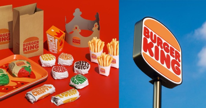
In order to reflect changes such as the removal of preservatives, Burger King has updated its brand, including its logo, product packaging, and restaurants, the fast-food chain announced on Thursday.
“We’ve been doing a lot in terms of food quality and experience,” said Fernando Machado, global chief marketing officer of Restaurant Brands International, which owns Burger King.
“We felt that putting a wrap around all that with an upgrade of our visual identity would help signal to our consumers that this is a brand that’s evolving.”
A new logo with a rounded font that matches the shape of its burgers and other menu items is included in the rebranding, Burger King’s first in over 20 years.
Bold colors in shades of brown, red, and green are a reference to the flame grilling process of Burger King and the use of fresh ingredients, the firm said.
Earlier this year, Burger King revealed it will strip from its iconic Whopper burgers all artificial colors and preservatives as fast food franchises are gradually offering healthier alternatives to follow consumer preferences.
Despite the rebranding, the company’s notoriously eccentric plastic-faced character – The King – won’t be going anywhere.
“We love him the way he is, and he will continue to be weird,” Machado said.
Source: Reuters


Leave a Comment